I have started Toolbox as my diploma project. My intention was to create a script family that consists of styles differing not in traditional parameters such as weight or width, but in nature of stroke contrast.
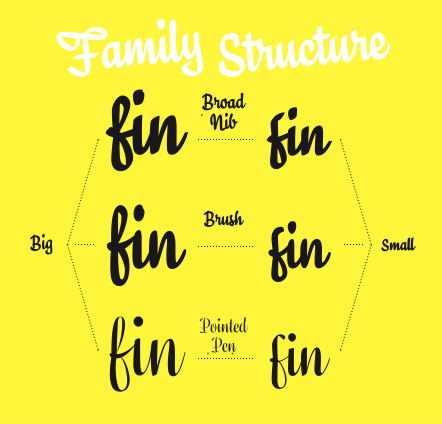
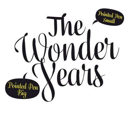
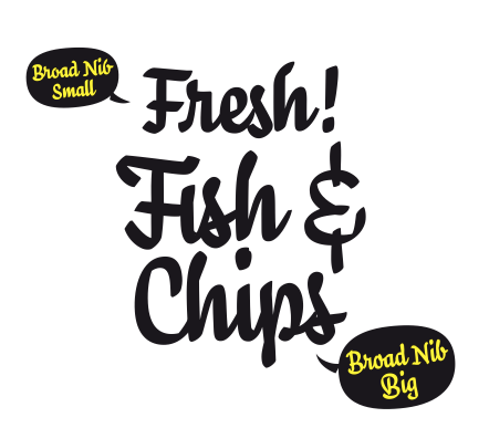
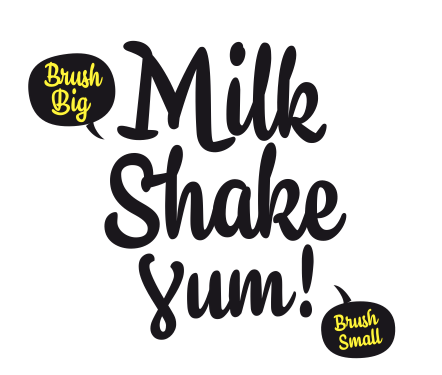
From the beginning there were 3 styles – each for one sort of contrast, named after respective writing tool – Broad Nib (translation), Pointed Pen (expansion) and Brush (rotation). In the end, though, the family got more branched than originally intended.
During the initial sketching I have noticed that letters drawn smaller tend to be simpler in construction than those drawn bigger. It brought me to the idea of having two construction levels for each tool: Big – more complex, dedicated to important informations Small – simpler, smaller, slightly wider, with a cap-height little above x-height of the Big construction (sort of small-caps characteristics), intended to use for less important informations.
