Nos Nos
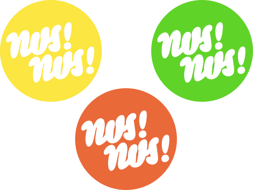
logo of a design shop
The logo was suposed to be a friendly impact maker, something that would resemble a pop-culture symbol, a bubble gum or twisted balloon, so it has round, low-contrast strokes and reduced to minimum inner spaces.
In czech ‘nos’ means both imperative of ‘to wear’ and ‘nose’ so some anatomical references are hidden there as well.


