Slovak Design Center
identity proposal
in coordinationtion with Komplot Advertising
Identities for design institutions are always tricky and never right. Express an opinion and half the audience will disagree, make it neutral and no one will bother.
Together with Komplot Advertising we tried to create something unobtrusive yet memorable and flexible to cover broad range of activities of Slovak Design Centre (SCD).
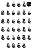
Logo/monogram is composed of simplified and rotated 'C' and 'D' shapes that together make the 'S'. To reflect evolving activities of the centre, raster filling the shapes changes its orientation in time (the concept was to regenerate logo each time it's used, creating that way a time-mark). Rasters and some sort of deconstruction are repeated across applications.
logo
phases of logo